Update – Due to regulations from government organizations such as GDPR and OFAC and for compliance with ICANN polices we are required to collect verifiable contact details for all Name.com customers when they create an account. That means we couldn’t keep the quick n’ easy sign up process any longer. I know, we’re bummed too.
You know how you occasionally go to a website and they get as clingy as a bad Tinder match who won’t stop texting you after you’ve given them your number? Yeah, we hate that too.
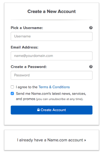
But here at Name.com we think getting all up in your business before we’ve even gotten to know each other is way worse, which is why we made it easier than ever to create a new account. With no phone numbers or addresses required, all we ask is for your email, a username, a password, and voila—you’re now a certified all-natural organic grass-fed Name.com user.

There is some pretty strong evidence indicating that a simpler and shorter sign-up process leads to more users, more revenue, and most importantly, a more user-friendly system. Alas, since we’re a domain registrar that has to follow ICANN regulations, we are required to collect and verify certain information from all of our customers. It took us a while to work collaboratively with our product, development, compliance, and marketing teams to generate synergy and figure out how to approach the situation, but the end result shows some real progress.
Creating a user-friendly sign up process
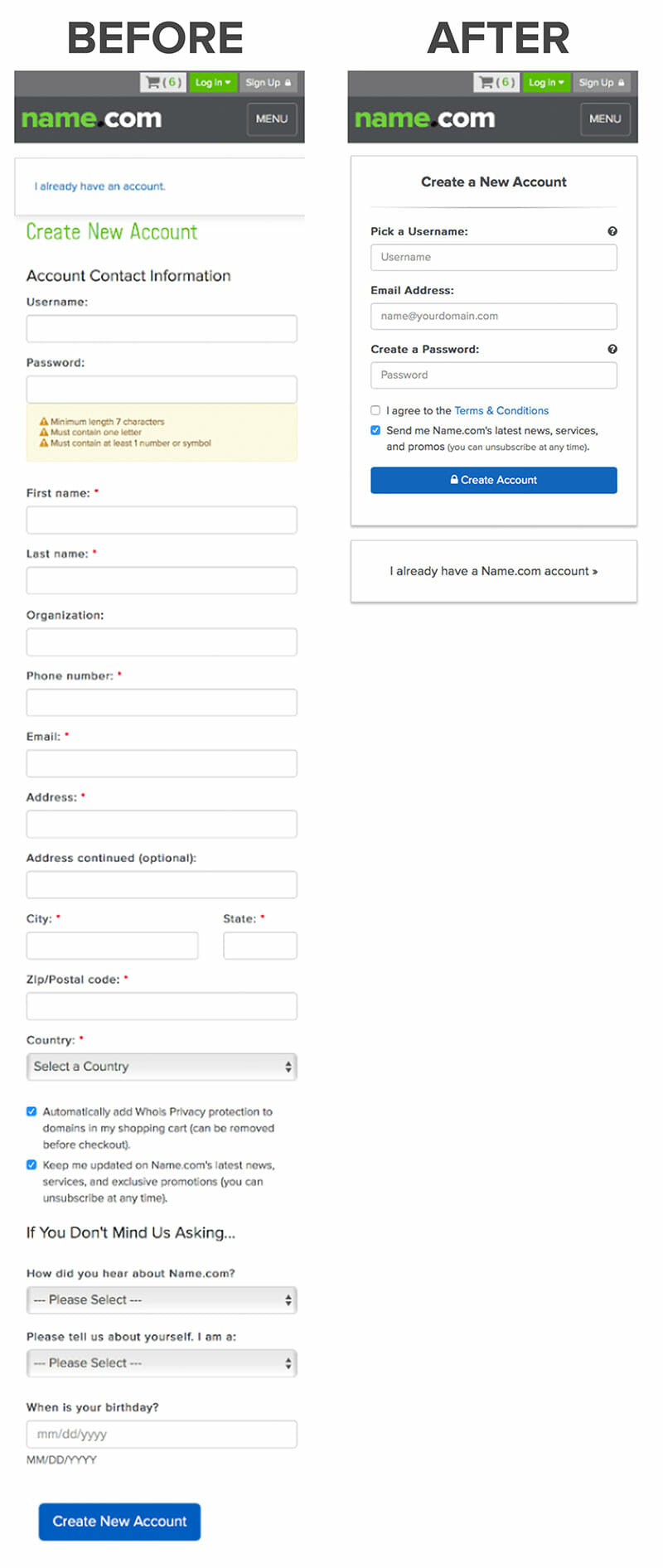
We wanted to make it as easy as possible for our new friends to create an account and give Name.com a test drive before committing to a full-on relationship. That’s why we updated our sign up form and reduced the number of fields from 18 down to just 3. Go ahead, give it a whirl, we’ll wait. If you like what you see, we can take the next step and make it Facebook official.
Our solution included moving some of the sign up information to a separate profile page where our new users could add additional details whenever it’s convenient. We also automatically collect some required information and validate it during checkout to cut down on extra roadblocks. It gives our users a quicker and easier sign up path so they can purchase domain names and website products without any hassle. We also spent some time focusing on our mobile experience so that users can easily create or access their account no matter which device they’re on.
Just take a look at the old and new version of our sign up form to see what a huge impact these changes made.

Shorter forms mean more conversions
It’s still early, but there are some pretty exciting numbers showing the impact of our change. We immediately saw a 30% decrease in bounce rate and a 18% decrease in exit rate on the account creation page. The less intimidating sign up process means fewer people are giving up and leaving. Time spent completing the signup process was cut almost in half as well.
We feel like this change is a big win for our future customers and we’re excited to continue making the internet a better place for everyone.
Want more website tips, domain news, and promo codes delivered straight to your inbox? Subscribe to the Name.com blog.


